It pains me to admit it, but even though I had visited their site, created an account, and played around with their tools, I didn’t really get the value proposition behind Plot.ly. I already use ggplot, bokeh, and d3.js, I already use knitr and ipython notebooks, so why do I need a new way of posting my plots on a web page?
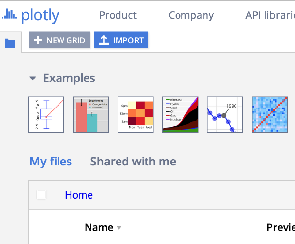
Plotly is a web-based platform for making graphs and analyzing data. Plotly’s APIs and web app let teams work together online to make 2D, 3D, and streaming graphs using R, Python, MATLAB, Julia, SAS, and and Excel, all together, all in one platform. The goal is to support technical and non-technical collaboration at all levels. Plotly translates ggplot2, matplotlib, and MATLAB plots into interactive, web-based, shareable plots.
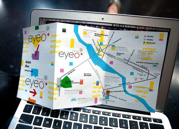
Last week, I got the opportunity to share the highlights from the eyeo festival at the DataVis LA meetup. The eyeo festival is a yearly event held in Minneapolis that draws together artists, technologists, designers, and many more people who work with art and computers. As I said in the meetup description, a lot of the things that caught my eye this year could be described better by the term “art” than straight “data visualization,” although there’s usually both at the festival. I also really liked that this year’s festival emphasized the history of computer art and data visualization. By bringing in Frieder Nake, Lillian Schwartz, and Roman Verostko, the organizers grounded us in the history that started in the 1960s.
Eyeo festival highlights
Amelia McNamara
From the festival website, “Eyeo assembles an incredible set of creative coders, data designers and artists, and attendees – expect enthralling talks, unique workshops and interactions with open source instigators and super fascinating practitioners.” I’ll talk about some of the most inspiring talks and projects I saw at Eyeo this year, including work by Santiago Ortiz, Lillian Schwartz, Cod.Act, Kate Crawford and Nicholas Felton. Most of this work can be described best by the term “art,” so come expecting provocations, not prototypes. To learn more about the festival, visit eyeofestival.com
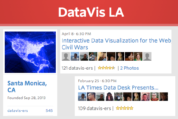
Data visualization helps us understand data. The DataVis LA meetup discusses the many aspects of data visualization: exploratory data analysis, presentation graphics, infographics, design, art, etc., and brings together a diverse community of data scientists, statisticians, software developers, BI specialists, business analysts, journalists, designers and artists with the goal of learning more about the art and science of data visualization from each other.