It pains me to admit it, but even though I had visited their site, created an account, and played around with their tools, I didn’t really get the value proposition behind Plot.ly. I already use ggplot, bokeh, and d3.js, I already use knitr and ipython notebooks, so why do I need a new way of posting my plots on a web page?
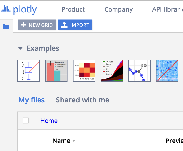
Plotly is a web-based platform for making graphs and analyzing data. Plotly’s APIs and web app let teams work together online to make 2D, 3D, and streaming graphs using R, Python, MATLAB, Julia, SAS, and and Excel, all together, all in one platform. The goal is to support technical and non-technical collaboration at all levels. Plotly translates ggplot2, matplotlib, and MATLAB plots into interactive, web-based, shareable plots.
It was a whole bunch of intense fun photographing so many of you at our Los Angeles User Groups Holiday Party last week! (Only junkies and programmers would think “User” is a good name for a holiday party.) But we do throw a helluva party, and nearly 80 of you were photographed for head shots. You guys are awesome, and we all really enjoyed it!
Yesterday, I published a post here on DataScience.LA with a simple/basic benchmark for dplyr. It was the main part of a short talk at our last Los Angeles R meetup. Below, I continue my thoughts with some reflections on dplyr’s API and philosophy, AKA the other part of my talk.
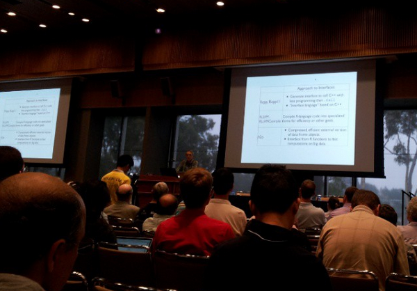
Earlier this month I gave a short talk about dplyr at the Los Angeles R meetup. It was one of the 5 talks about the useR! 2014 conference, and you can see the summaries and slides from the other 4 talks here.
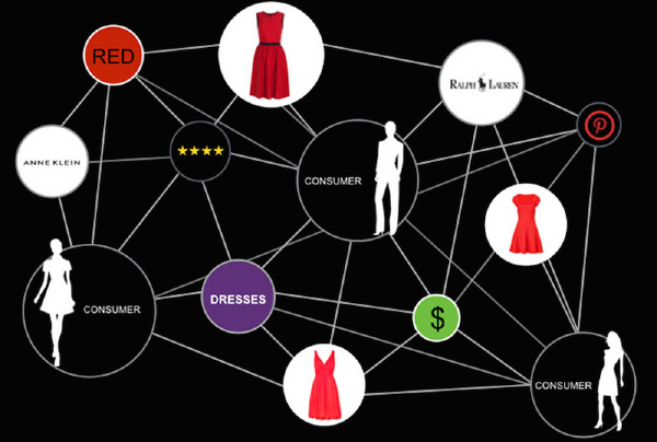
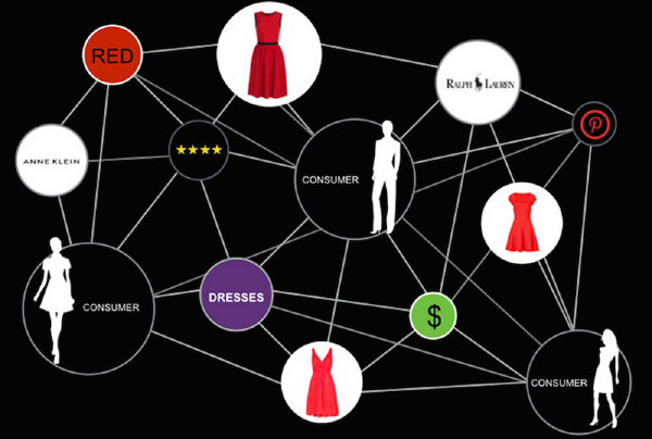
Data Science @ Datapop: The Marketing Knowledge Graph
presented by Dr. Ben Zamanzadeh, CTO at DataPop
Today’s eCommerce has evolved into a complex multi-dimensional optimization problem. DataPop’s semantic technology and Marketing Knowledge Graph is used to generate Omni-Channel advertising campaigns. This presentation will review our technology stack, machine learning models, discuss what worked what did not work for us and do a live demo of Marketing Knowledge Graph.
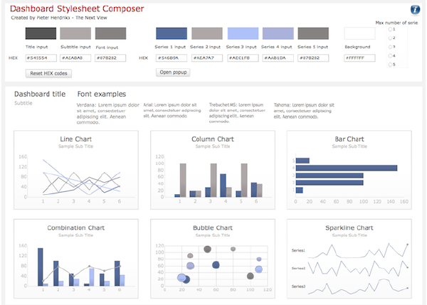
At this meetup we’re fortunate to have RStudio’s lead developer Joe Cheng flying in from Seattle to talk about Shiny. Shiny makes it possible to develop interactive web applications by writing only a handful of R code. It lowers the barriers to constructing interactive dashboards that you can use to better explain your results to your boss and/or co-workers, or it can help you productionalize your analysis so that others in your company can make use of it regularly without the need to continually bother you.
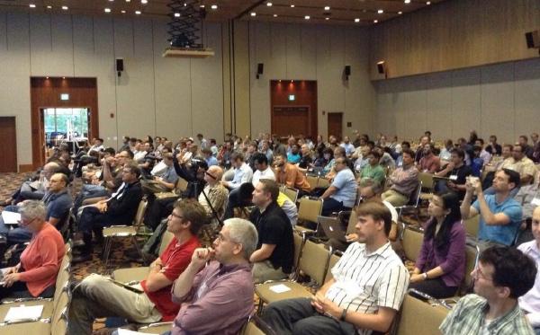
Last week the LA R meetup featured another round of 5 speakers each highlighting a few things they had found interesting at the useR! 2014 conference. This was the second such event after the first one in September - probably because useR! was awesome enough that it inspired 10 volunteers to stand up on stage and talk more about it.
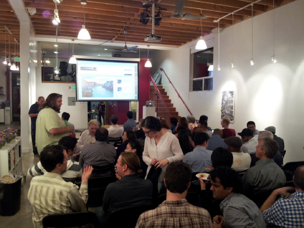
Last week, the Python Data Science LA meetup debuted with a fabulous event. It was already much anticipated, with more than 250 people showing interest (RSVP+waiting list), and a lucky 100 converged upon the hip Venice Arts venue to hear our speakers. Our sponsor OpenMail has also done a fantastic job in getting us this venue, bringing food+drinks and taking care of all the details. Thanks OpenMail Team!
Part 2 of the dplyr tutorial is now available! Hadley will be covering Grouped Mutate/Filter, Joins, Do, and Databases. (You can find Part 1 of the tutorial here.)
For our viewers who have just discovered the wonders of R, keep in mind that this tutorial was filmed in early July of 2014. As R packages naturally update over time (well, depending on the programmers!), please make sure to check Hadley’s Githubfor the latest changes to the dplyr package.
At this meetup, five more LA R meetup members will present short talks of what they have learned at useR! 2014. This is the 2nd round of talks about useR! since we had twice as many volunteers to speak as we could accommodate in one meetup (indeed, useR! was that awesome). The first round of talks at our September meetup is summarized here (with slides).
I ♥ data. But I also ♥ privacy. Even though I have been running a few data meetups for the past few years, I have managed to keep myself out of public eye - even in my professional life. I must admit, I’m giving a bit away in an recent interview with Data Science Weekly. They had excellent questions to pose, and I’d like to take a moment here to summarize two main points from the interview: my thoughts on when and how much time it took me to became a data scientist and how I feel about the hype in the field today. If you’d like, you can read the full interview here.
David Diez works on the OpenIntro team, which develops open-source textbooks, statistical software labs, and other course resources for intro-level statistics. This video above is the talk he gave at useR! 2014 entitled “Textbooks fail where Software Succeeds” in which he outlines the challenges unique to open-source textbooks, the state of OpenIntro, and how people can get involved. Below, he discusses these challenges further and offers his thoughts around their solutions.
JJ Allaire has courageously bet, time and time again, on the cutting edge of technologies. In doing so, he has not only benefited from the fertile rains but has often times himself been the rainmaker. He has, to a great degree, democratized development on the web by bringing the power to create interactive web applications to a wider audience than those select few who had access to both a shell account and Unix knowledge. ColdFusion was a platform by the web and for the web, and its adoption revolutionized programming ‘for the web’ as its own worthy pursuit. This story also resolutely validates the idea that by creating tools for developers at the beginning of a time of revolutionary change in technology, one could not only validate the tools but also help stage the unfolding narrative as one with many participants.
Hadley Wickham (perhaps you’ve heard of his work) presented a 2 hour workshop on dplyr at this year’s useR! conference at UCLA. This tutorial was definitely a highlight of the week-long conference for me, and working on this tutorial video has also made me very appreciative of how versatile the dplyr package can be. It clearly is the chef’s knife of data science tools.
Hadley Wickham is hard at work, releasing packages which leverage the expressive power of R to keep easy things intuitive, and to make hard things possible. Having already developed a number of packages which address other steps in the data processing and analysis pipeline, he chose to address the process by which R developers ingest, manipulate, and transform data. This package, dplyr, is a narrowly focused library, designed to provide 90% of the functionality required in most data munging tasks. It may not solve every possible problem in data munging, but dplyr’s built in primitives will reduce your need to drop to “base R” for most common tasks. It does so by leveraging the magritr package’s “pipe” operator, and is inspired by dataflow programming constructs. It is fast, it is powerful, and it has been the single largest productivity boost that many of us here at DataScience.LA have adopted in 2014. In this video, Hadley provides a very quick introduction to the dplyr package, describing his philosophy behind the package’s design while providing a number of illustrative examples as to the flexibility, expressiveness, and power of this tool.