It pains me to admit it, but even though I had visited their site, created an account, and played around with their tools, I didn’t really get the value proposition behind Plot.ly. I already use ggplot, bokeh, and d3.js, I already use knitr and ipython notebooks, so why do I need a new way of posting my plots on a web page?
Plotly is a web-based platform for making graphs and analyzing data. Plotly’s APIs and web app let teams work together online to make 2D, 3D, and streaming graphs using R, Python, MATLAB, Julia, SAS, and and Excel, all together, all in one platform. The goal is to support technical and non-technical collaboration at all levels. Plotly translates ggplot2, matplotlib, and MATLAB plots into interactive, web-based, shareable plots.
Winston Chang’s “Interactive Graphics with ggvis” talk at useR! 2014 was in many ways a watershed moment for the the data science community, as the future directions of rich data visualization for analytics, communication, and the web were revealed. In this talk, Winston introduces the viewer to ggvis, lays out the fundamental architecture, and provides an overview of reactive architectures.
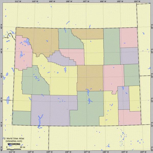
I’ve had a lifelong fascination with maps, and working with R definitely enables my map habit. Perhaps there’s something about being an immigrant that made me particularly introspective, since from a very early age I was aware that I was “from” one place on the map and now lived at this “other place.”